Day #051: The future of “RVA”
How can “RVA” expand without becoming trite?

Inspired by Michael Bierut’s 100 Day Project, 100 Days to a Better RVA strives to introduce and investigate unique ideas to improving the city of Richmond. View the entire project here and [the intro here.] (http://rvanews.com/features/introducing-100-days-to-a-better-rva/114345).
- Idea: Formalize “RVA” and put it into cornerstones, a coat of arms, and a large sign.
- Difficulty: 1 — It would be cheap and effective.
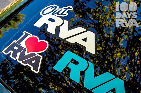
Over the last decade, the moniker RVA has become a ubiquitous sight on bumpers, bikes, laptops–just about anything imaginable. So simple and neat, the growth of those three letters are a microcosm for the momentum of this city over those ten years.

Richmond should standardize RVA and put it on city building cornerstones and infrastructure, deemphasize the flag, put it into a coat of arms, and build a large attraction-oriented sign out of it.
European cities have rich history that have created incredible brands over centuries. Newer cities, like Richmond, have the potential to build their own unique stories, but that doesn’t mean it isn’t worth stealing a few ideas every now and then. It turns out some of our much older trans-Atlantic neighbors are very good at branding–the type of branding that last centuries.
Triple Xs dot everything from parking pylons and building cornerstones to sex shows in Amsterdam. Amsterdam’s logo is second in notoriety only to their bizarre wooden clogs, and it surprisingly has nothing to do with the sex industry. They reference the wooden X on which fisherman St. Andrew was crucified in 1st century AD, and they were added to the coat of arms in 1505 when Amsterdam was simply a fishing village. Amsterdam is one of many examples of established logos across Europe.
Amsterdam’s “i amsterdam” sign on the Museumplein is also another good idea for Richmond. With the terrible Carytown sign now most likely voted down, Richmond should investigate a permanent RVA sign in Carytown, Monroe Park, or Browns Island. Or the city could make a bold move and put the sign in the underperforming part of the Canal Walk or a part of town yet to reach its potential.
The Richmond flag undoubtedly has plenty of potential. Its worker on a bateau channels history, but it is highly derivative of the Union Jack. It was ranked the 15th best flag by the North American Vexillogical Association in 2014 and a simpler monochromatic version could work. With an old flag that reflected the Jim Crow south, and a state flag depicting murder, maybe its time to let the organic powers of RVA take hold of the future.

Richmond finds itself in an interesting situation. “RVA” walks the thin line between trite and a unifying source of city pride. It has the potential to grace building cornerstones, to be the scenery of selfies circa the year 2523, and to be the focal point of a Richmond coat of arms, but it also has the potential to be overused and reduced to its original meaning: the call letters of the Farafangana, Madagascar airport.
Personally, I love RVA. With only three letters, it carries meaning for me second only to USA, and I hope the posterity of this city can look upon it with even more pride. 500 years of branding starts somewhere, maybe it’s time to set “RVA” in stone.
Love this idea? Think it’s terrible? Have one that’s ten times better? Head over to the 100 Days to a Better RVA Facebook page and join in the conversation.
Photo by: ourwanderlife
-
Recommend this
on Facebook -

Report an error
-

Subscribe to our
Weekly Digest


Notice: Comments that are not conducive to an interesting and thoughtful conversation may be removed at the editor’s discretion.