PHOTOS: The homes of Baskervill
When not creating award-winning projects, Baskervill designers tinker with their cribs.
Local design company Baskervill created the award-winning VCU Brandcenter and Snagajob headquarters, re-envisioned the 17th Street Farmers Market, and proposed a transformation of The Boulevard to accommodate a new baseball stadium, among other projects. Founded in 1897, the firm employs some of the best architects, engineers, and designers on the East Coast.
That got us thinking: what do their own homes look like?
Several on the firm’s team let us peek inside their homes and discussed how and why they personalized them.
— ∮∮∮ —
Bob Clark
President
We began renovating our 1970s-era home along the Old Gun Road corridor several years ago, adding a garage and extra living space to the existing structure. One of the issues we faced during the renovation was how to best design for the constrained, wooded site. The final design ties in natural elements like stone with contemporary, clean lines.
The kitchen was one of the biggest transformations in our renovation. We removed several walls to create this loft-like space that links the kitchen, dining room, and living room into one spacious area. The clean aesthetic of the kitchen reinforces the design theme present throughout the rest the house. And as with most homes, the kitchen is the center of gatherings we have, so we wanted to be able to accommodate a lot of guests around the 12-foot island. The constraint most difficult to overcome for the kitchen area was the narrowness of the space. Using suspended lighting helps to draw the eye upward to the vaulted ceiling which really makes the space feel bigger than it is.
— ∮∮∮ —
Alan Davis
Architect & Associate Principal
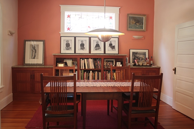
Our attraction to our 1925 house in the historic Ginter Park neighborhood can largely be attributed to the house’s multiple owners, all of who were artists or designers. The family who sold us the house had an eclectic and broad taste in art and design with furniture from Le Corbusier to Shaker style to Mid-Century Modern with Davi Det Hompson concept art in between.
The house’s first appeal–contrasting a Victorian home with Mid-Century Modern–was strong enough that we’ve made a few very minor changes. With Alva Alto stools and Charles and Ray Eames coat hooks from the previous owners, we are slowly working to infill the interior. It makes for a great backdrop for our three children to experience design and creativity in their daily lives, something important to us as parents.
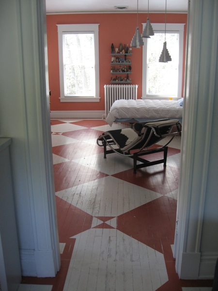
Touring the house before we bought it, we were drawn to the master bedroom. The previous owners had painted the (original) hardwood floors with this Amish-inspired quilt pattern, and they paired that feature with a cowhide Le Corbusier chaise lounge, modern whimsical pendants and other Mid-Century Modern furniture, pictured here.
When we moved in, we added our own furniture and kept the floors as is. It’s such a unique element to the home, especially when paired with those mid-century light fixtures.
— ∮∮∮ —
Kristen Dee
Interior Designer
I purchased my [Rockett’s Landing] condo two years ago in November and it has been evolving ever since. I really love a design that combines polished feminine pieces with accents of more masculine items to create a different vibe. I wanted to start out with a neutral palette and make various pieces of art the focal point of my living and dining room since I wasn’t sold on any one accent color. I have always leaned toward greens, pinks and blues but decided to start with neutrals first and decide on a permanent color later.
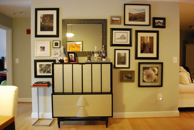
This antique mid-century dresser was found at one of my favorite consignment shops, Revival, and I decided I could repurpose it. I gutted the upper cabinets to make a reach-in bar and repainted the exterior for an updated look to match my grey and black scheme. Around the bar are photos I have taken while traveling throughout the years mixed in with a few prints that I have found recently.
Monograms are any southern lady’s best friend. I have been monograming anything I can get my hands on for years now and my nightstand lamps are one of my favorite items that I have made myself.
— ∮∮∮ —
Mark Larson
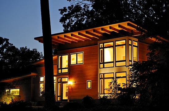
We bought a 1954 brick & block rancher in 2007 with an open view across Riverside Drive to the James River and the Carillon with the intent of renovating it to something more light-filled and open-plan.
We succeeded in keeping the house compact but flexible. An open center stair was added in the center of the house to connect the basement and two living levels. This openness allows us to entertain large groups. For Easter, the Fourth of July, and Thanksgiving, it is our tradition to host a dinner gathering of 40 to 80 VCU international students and friends. The house and sometimes the yard are filled, but people can see everyone and move around freely.
The old house had no insulation and small single pane windows. The renovated house has a high efficiency thermal blanket, Low-E windows, high-SEER HVAC units, and appliances. Despite adding 40% to the volume and tripling the amount of glass, our electric bills are now half of pre-renovation costs.
The structural wood beams that support the roof are exposed on the interior. Walls are minimal and light in color, allowing natural light to fill the house. The openness also allows our family to easily speak to each other from all parts of the house.
Most of the original oak floor was saved; a reddish stain helped disguise the transitions. Wood doors & cabinets are maple. The original fireplace was skinned with two types of stone.
— ∮∮∮ —
Sheena Mayfield
Project Designer
Lives in a 1930s Dutch Colonial in Northside

My personal taste is very eclectic, leaning toward modern/contemporary, but I live in a very traditional space. I love the interaction between the old structure and the new pieces that live in it. My office is really an escape for me, as the rest of the home is still a work in progress.
I love reclaimed and vintage pieces like the light table (c. 1970s) in the back nook. It was salvaged from an engineering office that was modernizing, and was fortuitously the exact width for this nook; a great find that I use it all the time for graphic design. My main desk (foreground) is my high school senior art thesis on mosaics and [optic] art. It has a few pops of primary colors that tie in my retro red office chair.
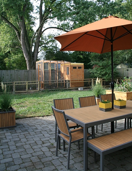
We have built raised vegetable beds, composting bins, rain barrels, and the short garden fence that divides the yard. Keeping with the design aesthetic from inside, these elements and the décor have simple and contemporary lines. The main structure in the yard is a coop I designed and built, the entire piece was made using reclaimed lumber. The screen door, for example, was a broken Ikea bed someone was throwing away. This summer I finished planting the coop’s vegetative roof. It filters and collects rainwater into a barrel, adding a functional sustainable element, something that is very important to me as a designer and frugal gardener.
-
Recommend this
on Facebook -

Report an error
-

Subscribe to our
Weekly Digest







There is 1 reader comment. Read it.