The new-look Rams: VCU athletics releases updated visual identity
The new visual identity for the VCU Rams is finally here. Check it out!
Today, VCU athletics released their new visual identity, which they’ve been teasing for the last couple weeks:
So Ram fans, what do you think? Here’s a video explaining the new-logo process and the release from the athletic department:
VCU Athletics has always pursued excellence on the field of play and in the classroom. Now the Rams will have a look to match.
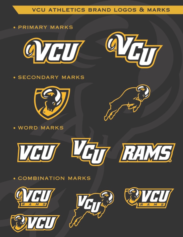
On Wednesday, the VCU Athletics Department unveiled its new visual identity series and brand marks. The series, which includes new primary and secondary logos, as well as a font style, embodies VCU’s bold, unique and progressive characteristics.
In recent years, VCU has risen to a position of national prominence in NCAA Division I athletics, notably with men’s basketball’s Final Four run in 2011 and the program’s move to the Atlantic 10 Conference in 2012. As more eyes turned to VCU Athletics, it became obvious that the program’s visual identity needed an upgrade to accompany the athletic program’s ascent.
“We’re very excited about our new visual identity,” said VCU Director of Athletics Ed McLaughlin. “This is something that is important for the future of this department. These marks strengthen the VCU brand and will factor in everything from marketing to recruiting. These will represent who we are. When our fans and our student-athletes walk down the street with these logos on their shirt, they can do so proudly.”
Last year, VCU assembled a committee of university staffers, athletic department personnel, and coaches to spearhead the effort to enhance the visual identity of VCU Athletics.
After having 30 local, regional and national companies bid on the project, the contract was awarded to Rickabaugh Graphics, the top athletics logo design firm in the country, to create a look that represented the school’s bold vision. Ohio-based Rickabaugh has created logos for schools from every major conference and NCAA Division, including Ohio State, Marquette, Vanderbilt, Seton Hall, Connecticut, Baylor and the Big East.
The company presented 16 initial concepts, which were narrowed down to four finalists. At that point, VCU Athletics met with constituency groups that included students, student-athletes, coaches, staff, season ticket holders and donors to solicit feedback.
The complete rollout, including uniforms, fields, courts and more, will take about a year to complete. A new court design at the Verizon Wireless Arena will be a part of the process.
-
Recommend this
on Facebook -

Report an error
-

Subscribe to our
Weekly Digest

Ross Catrow
Founder and publisher of RVANews.

Notice: Comments that are not conducive to an interesting and thoughtful conversation may be removed at the editor’s discretion.
VCUarts has the highest ranking ever achieved by a public university school of arts and design and is the only public university to consistently rise in the rankings… And they farm the logo out?!?!?!
Haven’t decided if I like the new logo yet or not, but regardless, I wonder why VCU went outside the school? Why not make it a project for students at the VCU Brandcenter?
For an athletic department whose main program’s mantra is “Havoc”, this new logo and wordmark do not scream it at all. The new Ram looks like a docile kid about to gently headbutt their opponent. As a VCUarts/Graphic Design graduate, I’m shocked they didn’t make this an inside job. You have the nation’s top design program at your fingertips, and these are designers who know Havoc, and know VCU Athletics. Sure, Rickabaugh Graphics is a top firm for athletics logos, but you’re going to end up with a logo that looks like all the other logos they have done.
Is the logo available to download yet?
I think the logo’s fine. An improvement. But I also am a bit dumbfounded as to why they wouldn’t have VCU’s art students design it themselves.
Listen. If they would have done the logo inhouse, it would have been terrible. TRUST me.
Hmmm not sure about the new logo yet…I don’t hate it but I don’t love it…maybe it’s an acquired taste
Not horrible, just bad.
Back in 2010 or so there was a university wide project to design a new Rodney the Ram. The designs were posted online and people could login and vote for their favorite. Then they quietly left it alone.
Some of the designs actually had a nice occult/Gwar show flavor to them. I think the lesson was that the university bigs weren’t going to like in-house designs and people would likely get upset if you gave them the semblance of choice and then dismissed their opinions for one that matters more in the “staying employed”/”collecting alumni dollars”/”selling merch” scheme of things.
I like this design better than the Fordham Rams’, but less than the Rhode Island Rams’. Would have really liked to see more of an occult Egyptian Building/GWAR design. You know, something more Richmond and less “insert generic sports logo here”.
But at least it’s not a ‘Billiken”.
The RAM should have some tattoos on it and a piercing…..make it look like the students!
Ross Catrow should have designed the logo, he’s got a lot of spare time since the commonwealth power rankings are no longer available.
I also agree the logo should have incorporated Havoc in some way, this is a big disappointment for an athletics program led by their basketball team, who already have a great brand in ‘Havoc’.
It’s extremely common to outsource your own identity. It’s hard for someone inside the organization to a)see the company without prejudice and b) to get the leadership to actually buy into their vision. It creates much stress on both sides and a frustrating process. Using an outside agency allows the work and feedback to be more evenhanded.
That being said, I agree that this look is too docile.