
RVA menu design, categorized and analyzed
Menus! Menus are neat, not just because they hold the secrets of what we’re going to be eating soon, but because they say something about the restaurants they come from.
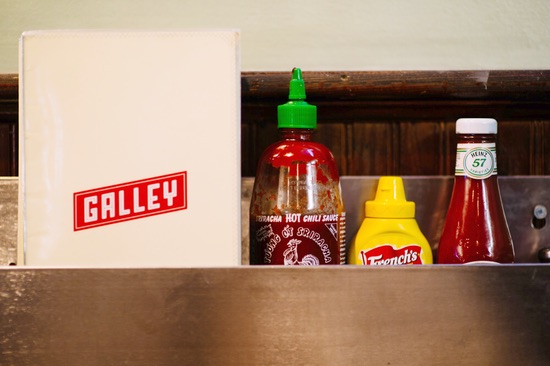
Photo by: Charles Cameron Lewis
There’s more to a menu than dishes and their prices. A menu is a vehicle for the chef to share his or her voice with the eating public without the laborious practice of going table to table and actually sharing his or her voice with the eating public. Ain’t nobody got time for that.
Richmond restaurant menu design tends to fall into one of three categories: Minimal, Gilded, or Constantine Giavos. Whether it’s a chalkboard, a tasseled book, or a retro placemat, Richmond menus give us plenty to look at while exchanging pleasantries with fellow diners and battling the headless hunger monster within.
Minimal
These menus want none of your frills!
Like the Amish, minimal menus are straight-forward and light on embellishment. These are typically chalkboard menus or one-page print-outs. Some of Richmond’s most iconic restaurants, including Millie’s, Ipanema, and Zeus Gallery rely on the chalkboard delivery system.
The chalkboard menu is probably the first contemporary menu, dating back to the second half of the eighteenth century, when restaurants in France began to move away from serving family-style house specialties, chosen by the chef each day, in favor of à la carte (meaning “from the board” and not, as I had assumed for all these years, “from the cart”) selections, once and for all putting the power of choice in the hands of the diners.
Fine dining spots like Heritage, Secco, The Roosevelt, Saison, and Dutch & Co. tend to favor the one-pager and menu copy gravitates toward the taciturn. Here’s the standard format:
SPICED DUCK BREAST
Carrots, concord grape jus, pistachios, Tuscan kale1
A few words, followed by a list of ingredients, sometimes their sources, rarely mentioning cooking technique–a departure from the routine puffery of previous decades. These menus offer a simple, clean design with the restaurant’s logo and a requisite foodborne illness disclaimer and little else. Their simplicity is its own art, and talented designers like Ali Croft, Tim Skirven, and Dana Craig (plus The Roosevelt’s own T. Legget!) are among the designers (and bartenders) responsible for finding a clear, understated way to give the people their options.
In the conversations I had over three weeks of being weirdly obsessed with Richmond menu design, almost everyone mentioned Mamma Zu, which is funny because their menu is so minimal you can’t even hold it in your hands, but rather you must memorize it during the hot, awkward wait for your table, hoping to God you don’t forget what you wanted before someone takes your order. But it works. And it works because it does what it does completely. It commits, something that Constantine Giavos says is essential for restaurant branding: “Whatever you’re trying to do, do it all the way. Don’t half-ass it. Just commit to it.”
Gilded
Arctic death! Tassels! Octopi!
On the opposite shore of the Sea of Menus, you’ll find a whole different type of commitment. They’d be your Liberace’s, defined in a word: Fancy.
There are few Richmond menus fancier than The Rogue Gentlemen’s dining and cocktail menus. Cabin, a “grumble” of self-described “storytellers” and Steph-described “designers,” produce TRG’s menus, including a remarkable cocktail menu with 28 images crowdsourced by local artists and inspired by John Maher’s cocktail selection.

Cabin’s Conor Dooley explains how the ethos of the restaurant informed their approach: “Right now TRG is taking the public’s idea about ‘a fine dining restaurant with fancy cocktails’ and turning it on its ear. It’s about making great food and drinks more accessible by replacing pretentiousness with a healthy dash of irreverence.” He quotes menu copy: “If you’d like to add truffles to your tasting courses it’s an extra $15, and all of our original cocktails can be found in this funny book about Arctic death. Enjoy.”
Designer Anne Marie Wonder adds that the sketches for TRG’s winter cocktail menu–haunting, fantastical illustrations of yetis, whales, and eskimos without pants–were largely inspired by Stephen Gammell’s “Scary Stories to Tell in the Dark,” which filled me with the same sense of awe and dread I felt when, 20 years ago, I first discovered “THE CALL WAS COMING FROM INSIDE THE HOUSE.”
Dooley says, “The main priority is finding something that makes both us and the client happy and excited about the work. With TRG, we have a shared desire for anything we do to elicit some form of ‘I’ve never seen anything like this before, and I love it!’ from guests.”
And we’d be hasty to overlook the be-tasseled book (a quick read at just two pages) found at L’Opossum. Chef David Shannon says he was going for a “70s airport bar/lounge vibe” when he worked with Scott Fields at Number One Design to create L’Opossum’s menu and identity. The design process centered around…an opossum-about-town who wanders Oregon Hill?

Photo by: Number One Design
For Fields, the menu design was tied into the overall mood of the space and the sense of humor that Shannon had been so eagerly waiting to unleash on Richmond diners: “David’s concept for the restaurant really started when he acquired the building. I think he’s always been attracted to the unrefined flavor of Oregon Hill,” says Fields. “So since he was going to have a fine dining restaurant there, he conjured up the idea of a French-speaking, ‘bon vivant’ opossum that flits through the neighborhood without a care in the world. Hence, “L’Opossum” was born, and it all bubbled up from there.”
The design spills over from the walls,2 to the menu, to the carefully collected ‘Fancy Men’ business cards. The spirit of L’Opossum is infectious in every element: “All of the decorations, or shall we say ‘accoutrements,’ in the restaurant are all part of David’s years of collecting. He was so excited to have his very own place where he could display all of the things he loves and not have them packed away somewhere in storage.”
But what’s a menu to do when it has no place to which to refer? The Sub Rosa Bakery-based pizza pop-up series Pizza 2000, created by Sub Rosa baker Ben Burakoff, was just such a place-less concept. Ben’s idea for Pizza 2000 was to pay homage to great pizzas and dishes from iconic restaurants like Roberta’s and Babbo, by ‘covering’ them, in a sense, in his own style. He had NYC-based book designer Anna Thompson use that concept to design their first menu and promo flyers.

Photo by: Kate Thompson
Pizza 2000 is a bit of a paradox, both referential and irreverent with no brick & mortar location and very few rules; Thompson’s menu and flyer designs reflect that. Thompson explains, “If I had to simplify the collaboration, it was a lot of Ben encouraging me to embellish and overplay my lifelong natural tendency toward minimal design. I ended up with about 10 pages of doodles, and Ben came up with a lot himself. I hope those end up printed on a future menu.”
“I felt this project invited me to throw textbook ideas of typography and format out the window,” says Thompson, who created the entire menu by hand. “Ben had a sense of humor about it and wanted to implement that as much as possible,” says Thompson. “When you’re working with food, design can feel like personifying the different menu items. For me, Las Vegas-themed pizzas or octopus appetizers are just asking to be exaggerated illustrations.”
Constantine Giavos
One guy’s designs all over the place!
Almost every designer I spoke to mentioned one of Constantine Giavos’ restaurant identities, which include Perly’s, Galley, Stella’s, The Daily, Pearl, The Lab, and The Continental Westhampton. And every conversation I had on the topic with friends and fellow eaters eventually got back to the menu at Perly’s, without fail. Designing over half a dozen menus for some of Richmond’s best loved restaurants, Constantine Giavos has clearly put his stamp on the city. When I met with him, he came prepared with history, bringing two menus from the early days of The Village–when his family still owned the Richmond institution–tucked under the armpit of his leather jacket.
“I get my inspiration from the past,” he says, opening the circa 1961 menu and pointing to it as proof. “There’s nothing new about this. It’s all out there for you to see. Boxing things off, pushing a particular product. There’s a science behind this.”
You can see the history in many of the identities he’s created: Signage from 1950s and 60s Athens inspired the look of Stella’s menu and complimenting Meze Oro mirror behind the bar, while the original Perly’s sign was the inspiration for the rebrand. “The logo was sitting right there in front of us the entire time,” says Giavos. “Kevin and I decided it would be best to re-contextualize that and build the brand around the facade. It’s a gorgeous custom logotype. I cleaned it up and re-cut it and it’s now the logo.”

“So like Perly’s, for instance,” Giavos says, pulling out his own folded, annotated copy of the Perly’s placemat-style menu. “You talk to the chef, you talk to whoever owns the restaurant, and you ask, ‘What are we trying to say? Do we want to do a deli/diner? Do we want it to appear modern but still have a nod to the past to it?’ The easiest way to convey whatever it is you’re trying to convey is through typography. That’s the key part of design–it communicates the message. The style of the type is going to tell you what kind of place you’re eating at.”
Giavos’ top priority is in connecting the dots. Each piece has to work together, the way the pattern on the Perly’s menu mirrors the wallpaper, the repetition of type from logo to menu at Stella’s. It has to be part of a system, an intentional message, and one that, ideally, sells a lot of food. Readability is also not to be underestimated, notes Giavos, as he prepares to increase the font size on the current Perly’s menu in response to customer feedback.
“I like menus to be interactive. I’m not really a design nerd. I don’t really look at design blogs or magazines. I like stuff that looks cool. That’s rule number one. If it looks cool, chances are, people are going to like it. Of course there’s a design sensibility there, but if it doesn’t look cool, no one will say, ‘Oh did you see that menu?'”
-
Recommend this
on Facebook -

Report an error
-

Subscribe to our
Weekly Digest

Stephanie Ganz
Stephanie Ganz thought there would be pizza.

There are no reader comments. Add yours.